Components
All 32 UI components — shadcn/ui primitives plus custom compound components.
Primitives
Base shadcn/ui components.
Accordion
Alert Dialog
Avatar
JDASBK
Badge
DefaultSecondaryOutlineDestructive
Button
Card
Card Title
Card description goes here.
This is the card content area.
Dialog
Dropdown Menu
Progress
Scroll Area
Separator
Above the separator
Below the separator
Sheet
Table
| Name | Role | |
|---|---|---|
| John Doe | john@example.com | Admin |
| Jane Smith | jane@example.com | User |
Toast (Sonner)
Tooltip
Theme Toggle
Click to cycle light / dark / system
Form Components
Inputs, selects, and controls.
Input
Textarea
Select
Checkbox
Radio Group
Switch
Compound Components
Custom multi-part components for specific use cases.
Stat Card
👥
1,234
Total Users
+12%vs last week
💰
$56.7k
Revenue
-3%vs last week
📦
89
Orders
0%vs last week
Metric Card
Steps
👟
8,500steps
85% of goal
Entry Card
🏃
Morning Run
Today at 7:30 AM
5.2km
💧
Water
Today
6glasses
Post Card
Product Card
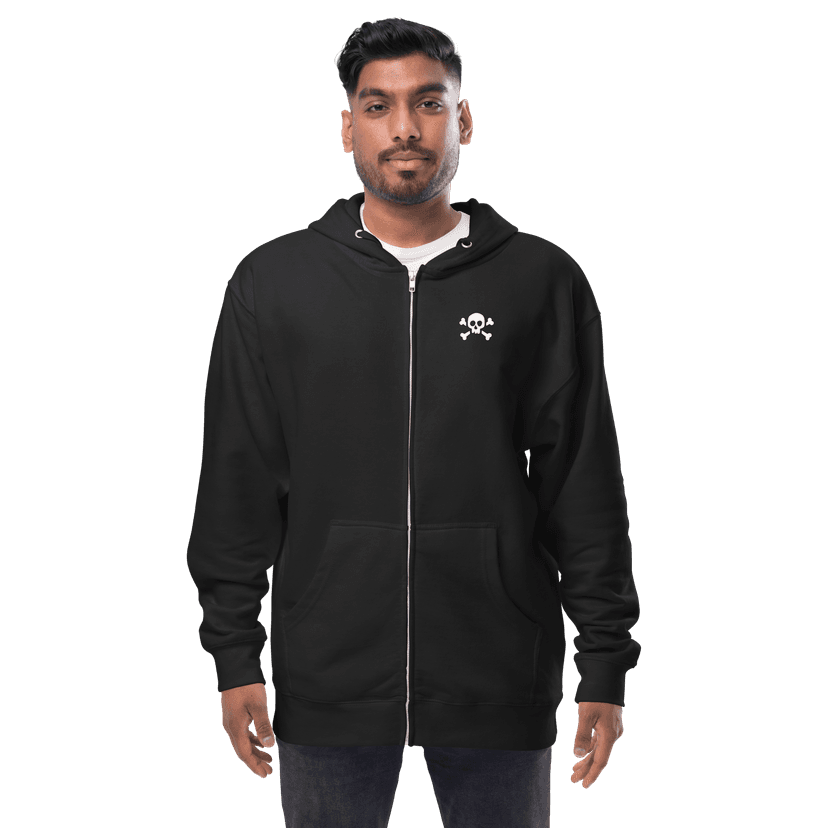
Cart Item
Zip Up Hoodie — Black / M
2
$110.00Progress Ring
75%
42%
100%
Prose
This is a Heading
Prose provides consistent typography for HTML content like blog posts.
Styled blockquote with left border.
Inline code and bold text.